
Open Science Visualization Technologies in the AgInfra+ Project
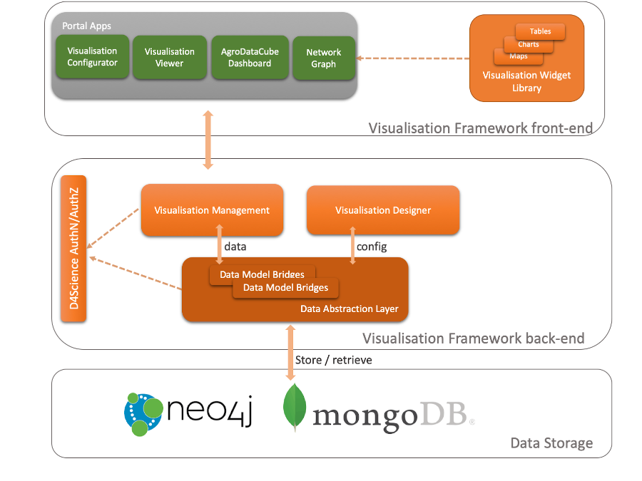
Data visualization employs the visual perception of observers, be it researchers, scientists, business analysts and in general users, to facilitate the delivery and extraction of knowledge relying on groups of data. It is defined as ‘the representation and presentation of data to facilitate understanding’ (Kirk, 2016: 19) and it can greatly assist in the quick detection of behaviors, patterns, trends, boundaries, accuracy, outliers etc. from complex data that may be of large scale, especially in cases that algorithms of automatic extraction of such information are not yet established. Though as an objective visualization is clear, the methods applied may vary substantially, employing different aspects of human vision for the delivery of its message, depending on the data, phenomena and the instruments via which it is delivered. Motion, coloring, area coverage, object sizing, Virtual Reality, Augmented Reality, image viewing, traditional charts and numerous other techniques are the arsenal, that information technology presents for delivering the cause, yet no silver bullet exists. Modern visualizations, especially ones targeting researchers and scientists, allow one not only to view data but also to explore those data in an interactive manner that exploits the semantics of data elements, relationships and the domain in context. This latter one, is a key point for the Aginfra+ project, which involves communities and scientists conducting research in the agri-food sector, working on various domains including Food Safety, Food Security and Agro-climatic and Economic Modelling. However, in AgInfra+ visualization comes in play to satisfy the substantially differing needs of its stakeholders, which depend on quite different forms of data, be it graphs, timeseries, geographical vector and raster data, photographs of species etc. Balancing among generalization and satisfaction of the requirements and specialties of each case, in AgInfra+ we designed and developed the “visualization framework” that consists of a number of both specific and generic instruments (be it libraries, services, UI components), that follows the approaches of “extensibility” and "pluggability”, allowing to minimize the effort required for supporting additional ad-hoc or typical visualizations for new data types, with different semantics and new delivery methods. The architecture of the framework is displayed below. At its lower end, it employs a multi-technology storage layer, picking the most appropriate one for the different types of datasets, while at the top layer it implements distinct, reusable widgets. The middle layer decouples the logic and technology of data from the presentation and adds all the tooling for management and delivery of visualizations to the user.
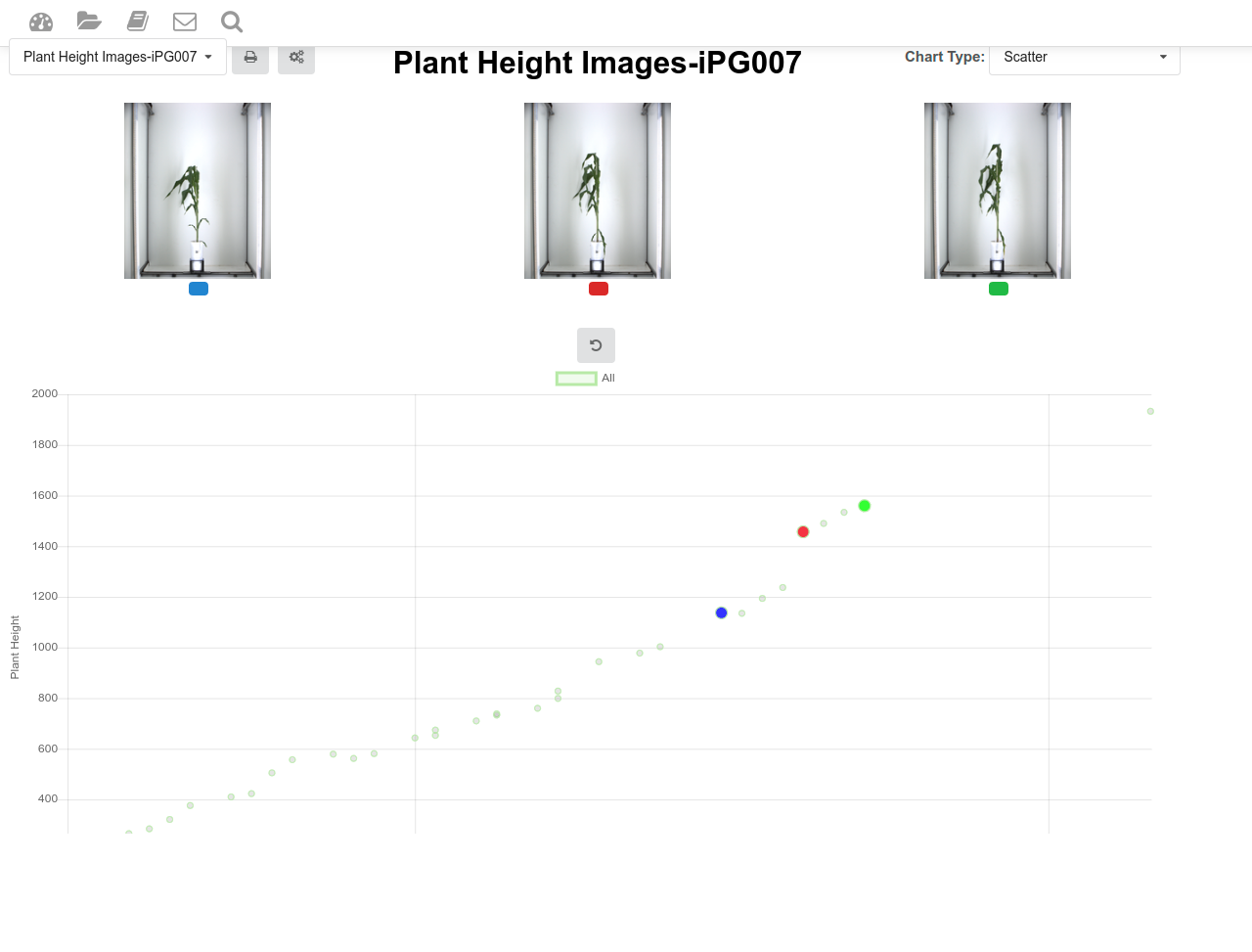
In the following text we present a few of the specific visualizations of expressed interest by Aginfra+ communities. For the Food Security it is important to visualize the height of plants at a specific time, in conjunction with the image of the plant for the selected point, and for multiple points, allowing them to compare plants’ growth at different times.
Another interesting aspect when visualizing data, is their spatial dimension. By exploiting this dimension, we provide an interactive way to visualize the positions of plants in a greenhouse at a specific through a heatmap.
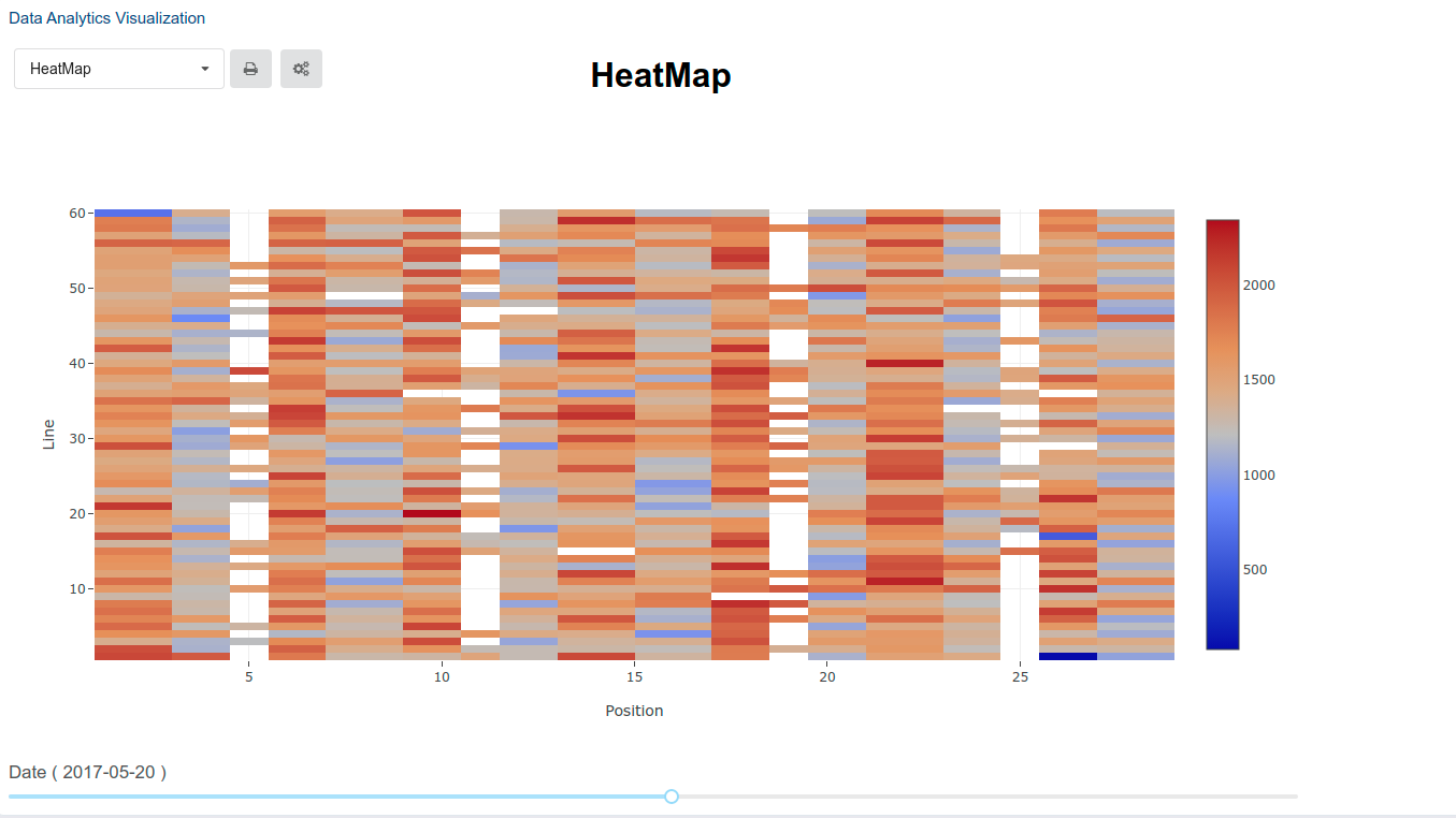
Plants Spatial Visualization using a Heatmap
By combining different visualization widgets, we offer a dedicated application to the Agro-climatic and Economic Modelling, called “AgroDataCube Dashboard”. Data are dynamically retrieved from the “AgroDataCube” service, which offers a big open data collection for fields in Netherlands (https://agrodatacube.wur.nl/). The application is an interactive dashboard where users can interactively and visually pick the fields via a Geographic Information System and subsequently retrieve crop information and other generic visualizations applied to the specific data set. Furthermore, they can execute simulation models on the specific data in view.
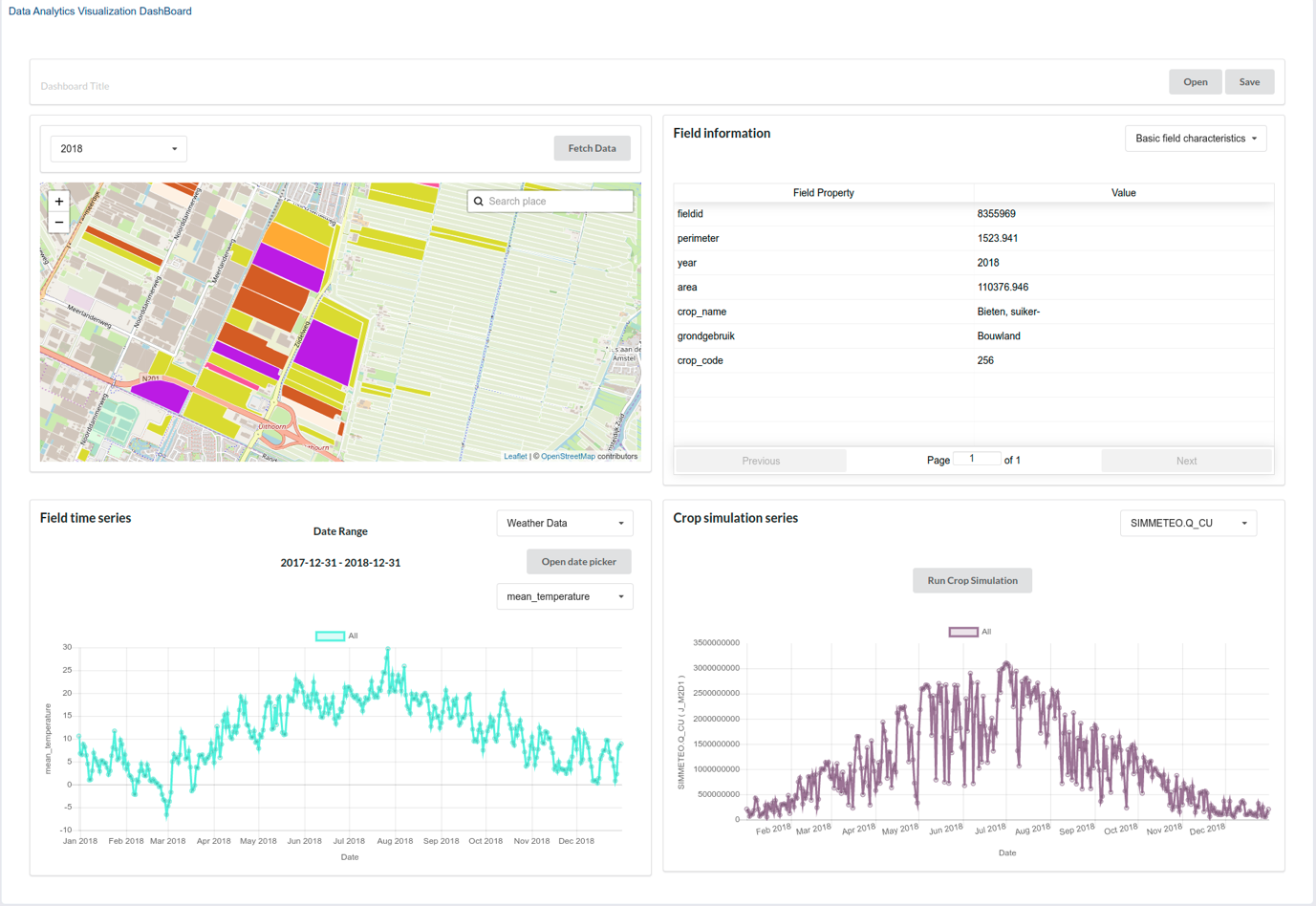
AgroDataCube Dashboard
The Visualization Framework offers a number of additional visualizations that are user configurable. The tools can be exploited through the Agrinfra+ gateway - https://aginfra.d4science.org/. For additional information visit our documentation page: https://support.d4science.org/projects/aginfraplus_wiki/wiki/D43_-_Open_Science_Visualisation_Technologies and https://github.com/madgik/VisualisationFramework/ This work has been supported by the AginfraPlus project, receiving funding from the European Union’s Horizon 2020 Research and Innovation Programme under Grant Agreement No 731001.
Authors: George Kakaletris and Panagiota Koltsida


